

Case Study: Patient Application 2.0
Task: Redesign the core application to satisfy the growing needs of our customers.
Role: Solo cross-functional product designer owning everything design at InQuicker.
Task: Redesign the core application to satisfy the growing needs of our customers.
Role: Solo cross-functional product designer owning everything design at InQuicker.


InQuicker’s patient self scheduling application was at a state where it had outgrown it’s original design intent of providing scheduling for patient’s immediate needs; Emergency Room and Urgent Care.
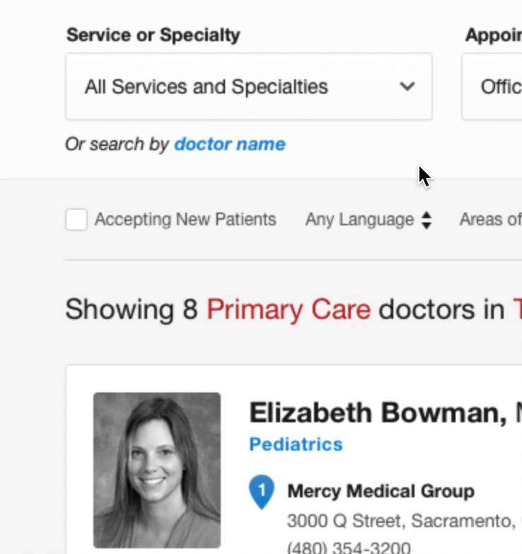
Recently Primary Care scheduling had been added and we could already see cracks start to appear. With a list of features and other general improvements that needed to be added, we knew we a redesign was in order.
The expansion of features to our core app will help fulfill our customers needs as well as our own goal to expand into larger markets.
Currently the app is able to serve Urgent Care, Emergency Room, and basic Primary Care needs. We need to expand the types of Provider coverage as well as basic market features to be competitive in the growing market space.
An updated and redesigned InQuicker gives our customers an application that will cover all their needs. They will no longer need separate tools to cover the gaps that the current application creates. A redesign will also give our customer’s patients a greater and more streamlined user experience.
Our customers are hospitals and larger health systems. The actual users of the app will be our customer’s patients. They are, in general, men and women who prefer to use the internet to schedule appointments rather than traditional phone calls. The age range is fairly broad - from 18 to 45. Desktop as well as mobile devices are used, at a rough 50/50 split.
Patients need an easy and quick way to find a doctor and book an appointment. Appointments may be soon or much further into the future, so they need an easy way to browse dates. Filtering based on insurance coverage and appointment types is important. Some patients have specific providers they visit, so they need an easy way to find their providers profile.
The patients might be at home or on the go. They have no specific time restraints, but the quicker they can flow through to appointment registration the better.
The current user flow worked and has been a proven design. How do we add new features without breaking what has worked for years?
An updated design created more screens but was still able to maintain a relatively simple and similar user flow.
The general steps of a flow a user takes is shown here left to right. The columns represent alternate states of a step.
We worked with our customers from wireframes through to the final designs. They helped shape and inform the product from Day 1. They had first hand knowledge of what their patients needed and were asking for, so they were crucial to consult with and learn from.
One thing we learned from was that patients really wanted to know more about the providers. So to help educate the patients we added an “About” tab to each provider profile where we showcased personal and background information.
A redesign gives the opportunity to go back and find the areas of the previous design that didn’t hold up over time. The app’s expanding needs sometimes led to areas simply being outgrown or bloated. Now was the time to address this debt.
An obvious element that needed an update was the Insurance filter. It had ballooned to an unusable size. The first step in improving the experience was to break it down into a two step process:
We added an extra click to the process, but drastically shortened the amount of scrolling needed.
Seemingly simple elements can become quite complex quickly. Clearly defining how these UI elements work in any state or scenario is immensely important.
Here I am defining how the pagination should work across our search results pages.
Users don’t always take the same path. The new maps view required us to think about the different way locations can be searched for.
A prototype is worth a thousand images.
Here I wanted to get a real feel of how a custom interaction would work so I prototyped a simple select box that allowed the user to clear the selection by clicking an ‘x’ icon instead of scrolling all the way to the top of the list.
This select box was naturally a long list so I liked this custom design over having the user needing to scroll.
When it comes to designing a series of micro-interactions it becomes paramount to fully understand not only the many different states a user may be in, but also understand how a user transitions between all those different states. When the design gets to this point in the process, prototyping becomes an extremely valuable tool.
This prototype illustrates how a user jumps back and forth from the Providers list view and the map view. Once in the full screen map view I show how a user can move from one Provider to the next, either by selecting a pin or scrolling through the cards on the bottom of the screen.
Most of the time verbally explaining how something works or visually showing static mockups and flows doesn’t accurately communicate the intent.
The first mini prototype here visually explains how we can add a bit of interest to the map with a pulsing GPS dot and drawing a suggesting route. A static mockup just wouldn’t do it justice.
The second prototype not only visually shows how a header can grow and shrink based on scroll position, but it also gives the user pseudo-tactile feedback while they scroll. The fun here is the transition itself, something only a prototype can deliver.
By the time time the design was complete we already knew it was going to succeed. Our customers who joined along during the design process were already on board. Their insight and help left little doubt that the rest of our customers would have any issues with the redesign.
If you’d like to read more about my thoughts on design or my approach and process check out my other case studies.
Portfolio Home
Project: Creating design guidelines and new patterns and components while updating, maintaining, and governing our design system called Hyperspace.
Sprinklr Design SystemCase Study: Redesign the core application to satisfy the growing needs of our customers.
InVision Case Study


