Unified Customer Experience Platform
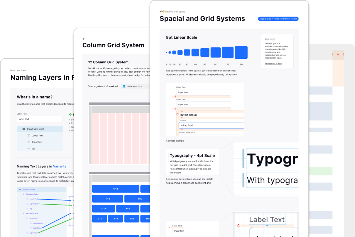
Project: Creating design guidelines and new patterns and components while updating, maintaining, and governing our design system called Hyperspace.
Sprinklr Design System
Task: Design a mode that helps close the gap between the end of the design process and the beginning of development.
Role: Product Design lead for Inspect Mode
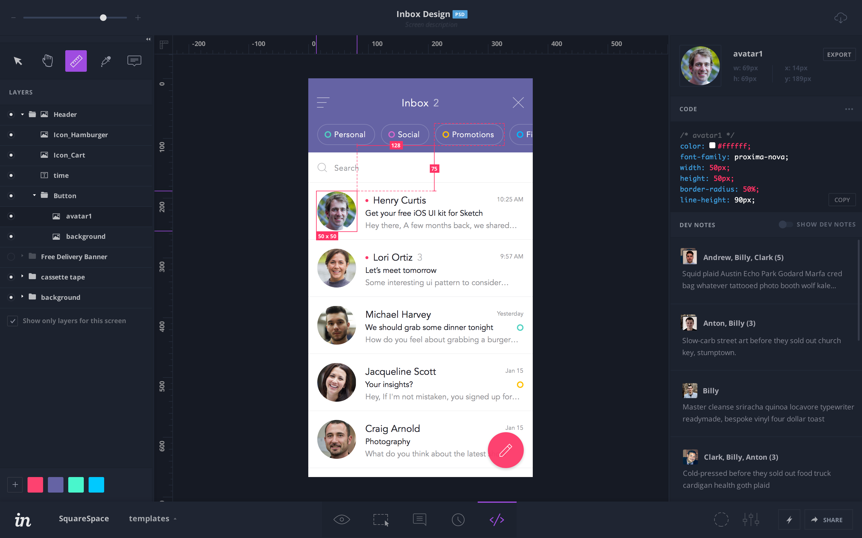
This feature helps complete the design process and workflow. Currently in the app there is no way for a designer to easily pass along design specs and assets to developers.
During the design handoff there is often a disconnect. Design documents get updated after the fact, developers don’t have the needed design software so they are stuck looking at static screenshots, discussions that helped shape the design are lost. Because of these problems developers are having to constantly ping designers for CSS values, hex codes, icons, image assets, etc. This is inefficient for both parties.
This feature would save time for the designer as well as bring efficiency to the development process. Having a single source of truth for the designs means the developer always has the latest designs and specs.
The interesting part of this new feature is that it will not only be used by our normal designer user type, but it will potentially be bringing on a new audience - developers.
Designers: This new feature needs to facilitate the efficient transfer of design details and specifications to the developer. Developers: They need design assets and specs. If they can get this from the new feature instead of working directly with the designer it removes a bottleneck. Another advantage is that this can be done whenever the developer needs.
The designers and developers using this will be at their desks; most likely in an office or their work space. Design for large monitors and high speed internet. Designing for mobile is unneeded.
Before diving into designing a new mode I decided to take stock of what we already had and really question if a new mode was completely necessary. There is a possibility that we could expand upon what we already had.
There are currently four modes: Preview, Build, Comment, and History. Could these new features live within Comment mode? Comment mode currently has comments, Dev Notes (a comment sub-type), and sketches/annotations. It feels like there would be a lot of potential overlap of features if we created a new mode. If designers and developers are already inside Comment mode, maybe we can keep all their conversations and interactions there.
New developer tools would have to be introduced into this mode so there might be real concerns with screen real-estate and overcrowding. Redesigning a current mode alongside adding new features is adding a significant amount of scope to the project as well.
Sketches and annotations could use a redesign. They are underutilized and viewed inside of an awkward modal view which pulls them out of context with conversations.
Working from the bottom up I’m trying to distill each mode into its functions and goals. Comment mode is essentially about communication, which is what the designer is trying to accomplish with the developer in our new scenario.
In this light, having developer inspect tools in comment mode makes sense. Renaming the mode to something more relevant would need to happen however.
Here I am auditing the current state of the sketch and annotation tool. How can we improve this feature and better utilize it with the new document inspection tools?
Let’s see how how sketches and annotations are viewed within context of a specific comment thread. Viewing all sketches and annotations of a screen at once would be incomprehensible, so we can limit the scope of them. We can also list comment threads on the left side of the screen for easier navigation (instead of relying on just the comment dots all across the screen).
Inspection tools could be accessed from a toggle in the top right of the screen. This allows a developer to use them whenever they need and in whatever context. We could have a panel for the inspection tools as well as one for the layers of the design document. This allows for the new tools to be the least interruptive within the mode. They can be there when you need them, and be hidden if not.
These series of storyboards are early versions of tying comments together with their associated sketches and annotations. They are shown in context with the conversation instead of separate modal window.
The storyboards are also displaying the first passes at how an Inspect and Layers panel could work within the mode.
The team didn’t have enough time or resources to handle the extra work needed to redesign Comment Mode in addition to the new features. The decision was to leave comment mode alone and go forward with creating an entirely new mode.
We know we liked the Inspect and Layers panel to be their own unique elements. We also liked viewing the list of conversations in their own panel, instead of the current system - which was clicking on dots on the screen. Another decision that was made was that we were only going to display Dev Notes, not every conversation type.
Let’s explore a few options…
How do we want this new mode to be laid out? We knew a few panels that we wanted to include and a general idea of the tools we wanted to include. It was still early and the mode itself was still being fleshed out.
Here are a few quick wireframes I did to get a feel for how we wanted the new mode to be structured.
The Inspect tab is where we are going to place the most needed tools a developer will need. Things such as CSS code, colors, layer properties, and asset export options.
The floating toolbar would be tools that the developer would use to interact with the document. These include zoom, panning, text tool, drawing/annotating, and a select tool.
By default the Select tool would be chosen. Selecting a layer updates the contextual Inspect tab which will then display the selection’s CSS properties, dimensions, coordinates, etc. Selecting a layer gives the user the ability to hover over a different layer and get distance measurements. If a designer wanted to highlight a specific distance or measurement for a developer, they could “pin” that to the artboard. Pinned distances or dimensions would remain on screen as callouts for developers.
These series of screens are simple wireframes designed to try and understand the user interactions with the tools and how the tools themselves interact with the design.
With a strong idea of the elements and tools we needed for the design and how those tools would work, it was time to start more polished designs and prototypes.
Each design was thoroughly prototyped, tested, and discussed with the team. There were also features being designed concurrently in other part of the InVision app that would affect my designs. Keeping shared elements consistent was top priority (layers tab, document zooming, document header, rulers).
The previous screens are just an overall glimpse into the amount of testing, prototyping, and iteration that went into designing the new Inspect Mode. Nearly every day for a couple months I sat down with the team and solicited feedback, worked through interactions, and presented new flows and ideas. As mentioned earlier, there were separate concurrent designs happening elsewhere in the app, so keeping these continually evolving designs in sync was a challenge in itself.
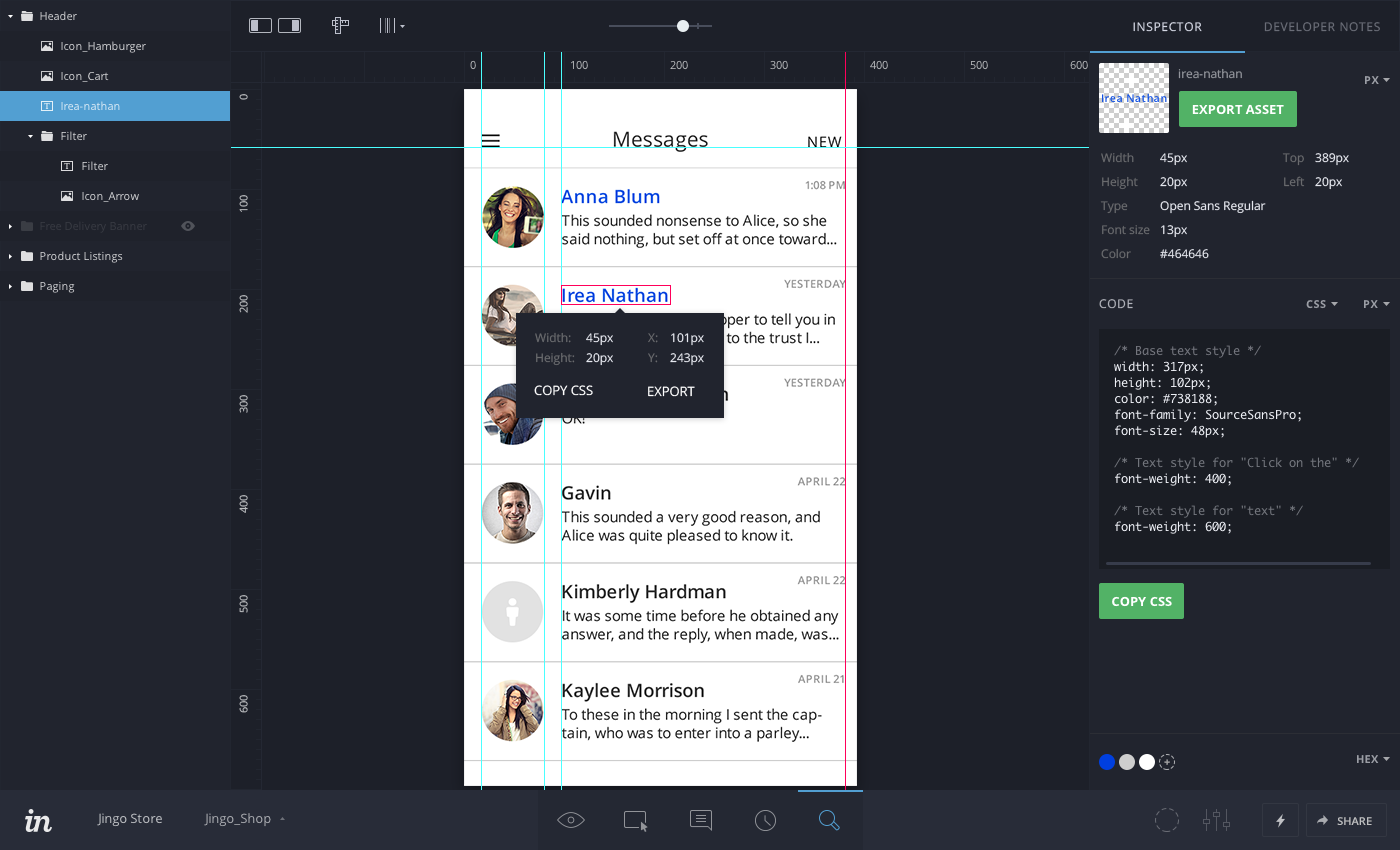
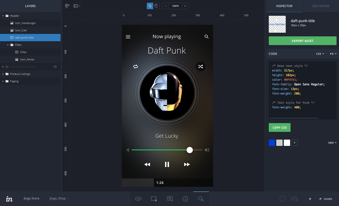
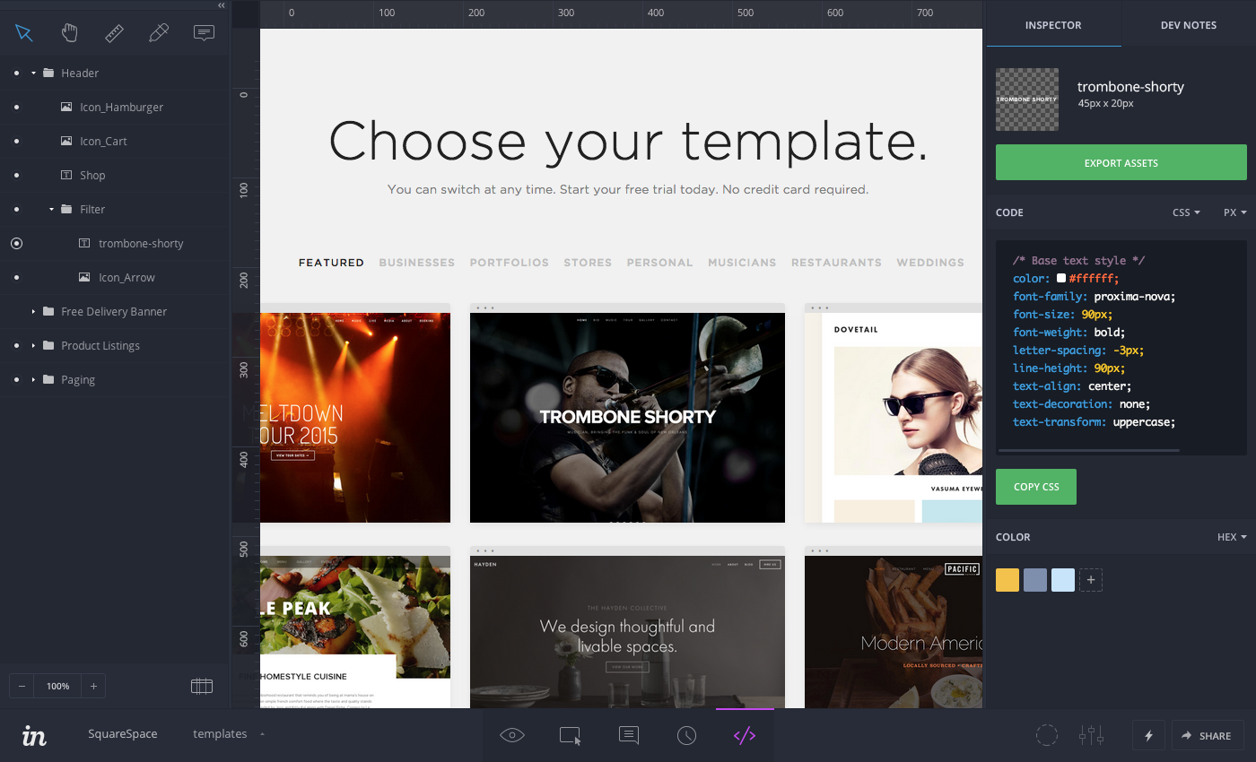
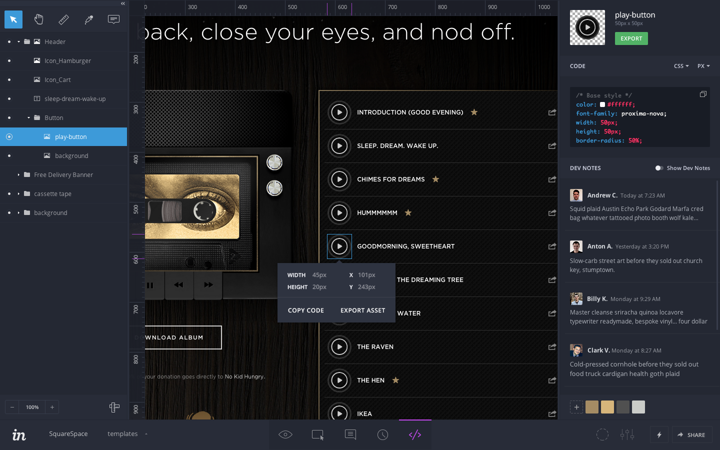
Through the iterations you can see work on where the toolbars were to be kept. We also added a contextual layer popup when you selected a layer, document rulers, and guides.
The addition of the contextual layer popup freed up a lot of real estate in the Inspect panel. It was enough room that we were then able to consolidate the Inspect panel and the Dev Notes panel. Instead of two tabs they now became one scrolling column.
If you’d like to read more about my thoughts on design or my approach and process check out my other case studies.
Portfolio HomeProject: Creating design guidelines and new patterns and components while updating, maintaining, and governing our design system called Hyperspace.
Sprinklr Design System
Case Study: Design a process to automate the renewal of memberships.
Sightbox Case Study