Case Study: Memberships Redesign
Task: Design a process to automate the renewal of memberships.
Role: Product Design lead for Sightbox's internal CRM, IRIS.
Task: Design a process to automate the renewal of memberships.
Role: Product Design lead for Sightbox's internal CRM, IRIS.
My role at Sightbox was lead designer for our internal CRM which was named IRIS. IRIS handled member data (payments, shipping, prescription info, scheduling). One thing it didn’t handle was the renewal of a membership once the prescription expired at the end of the year. It had no notion or idea how long a membership lasted or what to do when a prescription was expiring - so our support team was handling the entire process manually.
Before I could think about starting on designing an automated system, I knew that I needed to do some quality research on the current process. What actions and decisions was the support team having to make along the way? What data were they using to make those decisions? What data could help them that they didn’t already have?
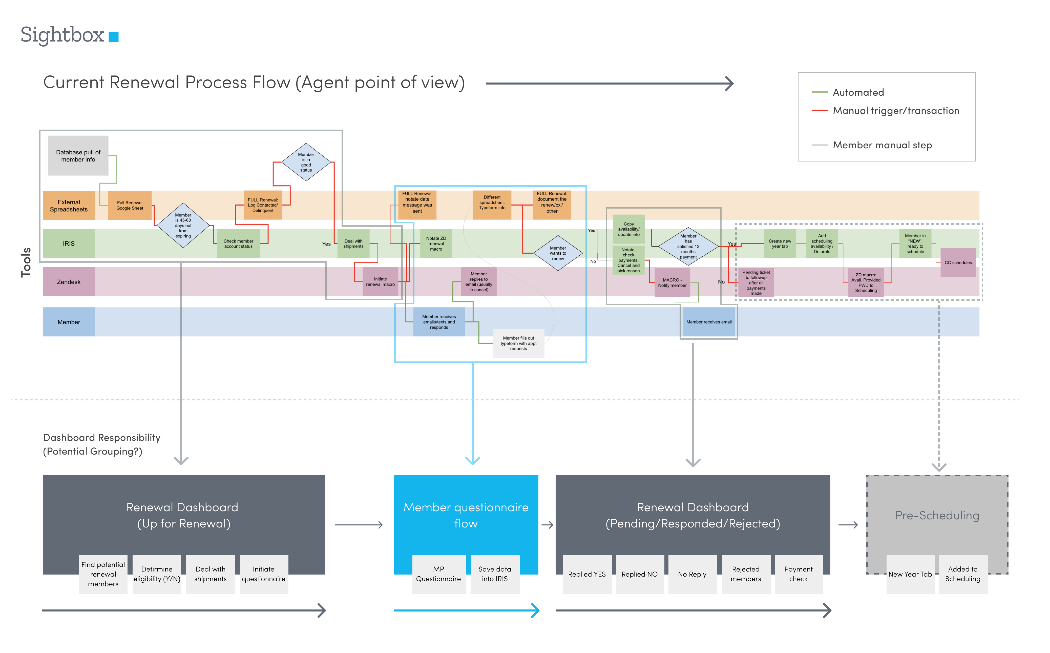
I started off by auditing the process flow from the support agents point of view. I sat down with the Renewals team and observed them going through their process. I documented all their steps. What criteria they were looking at, what decisions were made and when. What other tools they were using to fill in the gaps. What steps were manual, what were already automated.
There were a lot of steps, but overall it was mostly a linear flow; which was great, we can work with that. The hardest part to automating this would be around determining member eligibility. There weren’t clean rules and policies in place which led to a lot of subjective decisions being made with data that was hard to get.
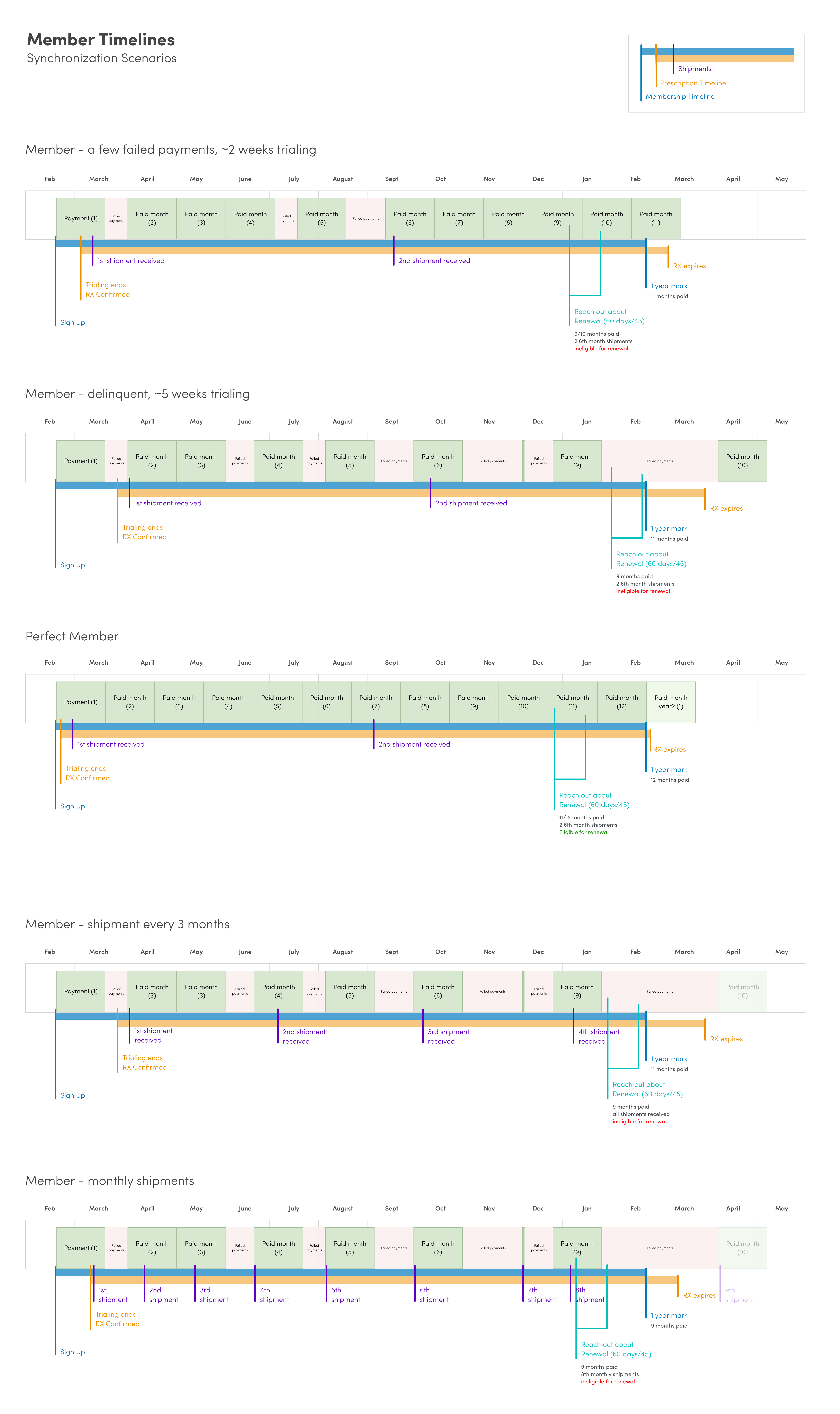
To get a better idea of all the variables a support agent needed to consider when determining if a member was eligible for a renewal, I mocked up various scenarios from a membership timeline point of view.
It quickly showed how easily out-of-sync various timelines could get and how taking a snapshot of a members timeline near the end of the year wasn’t an accurate representation of their status or eligibility. So again, how were we going to automate this complexity? Part of the reason the data was hard to digest was because IRIS had no notion of member states or status.
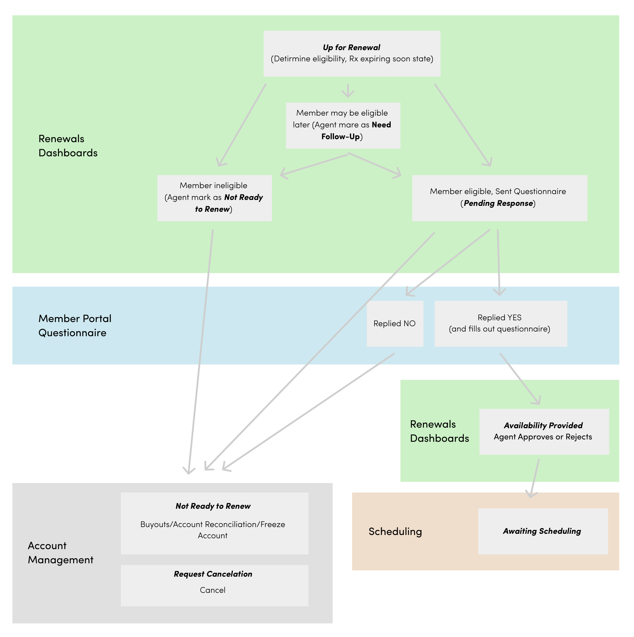
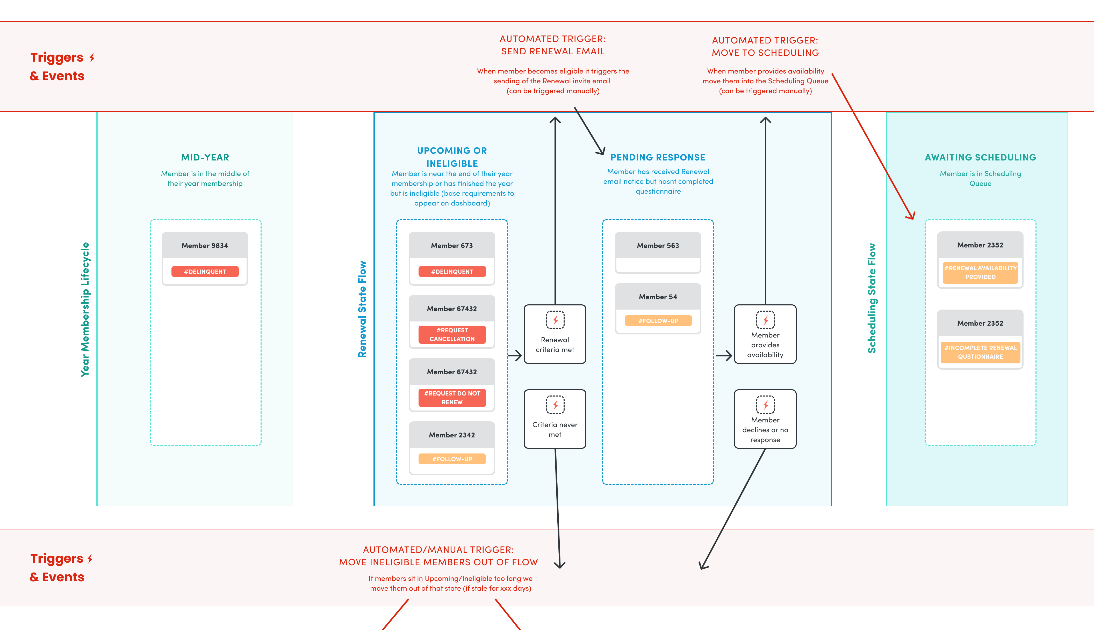
A system isn’t great at being subjective. It needs clear sets of data and a solid ruleset to do its job. IRIS didn’t have those things and would need them to automate. Using the more simplified flow steps from the process audit, I started diagramming out possible member state flows. How can we tag and track members through their membership based on key decision or action points?
I really wanted to learn more here, to dig deeper. I did a lot of external research and looked at how other systems handled state. I learned about Finite State Machines and how they are designed to simulate sequential logic, so I designed one for our system. The FSM here looks complex but logically it ended up being a much more clean and simple way to handle what we needed. Perfect for the system automation we were going for.
I consulted engineering about possible technical limitations or problems and found out they had been trying to do something like this for a while. They were completely on board and were excited at building proper state management into IRIS. This would help not only this automated Renewals project, but the system as a whole.
So I had a basic strategy:
We had the end goal, but how were we going to make smaller steps to get there? Proper state management wasn’t something that could be budgeted right away, so we knew manual decision making was still going to be needed at least for a little bit. What pragmatic steps would be most beneficial right now?
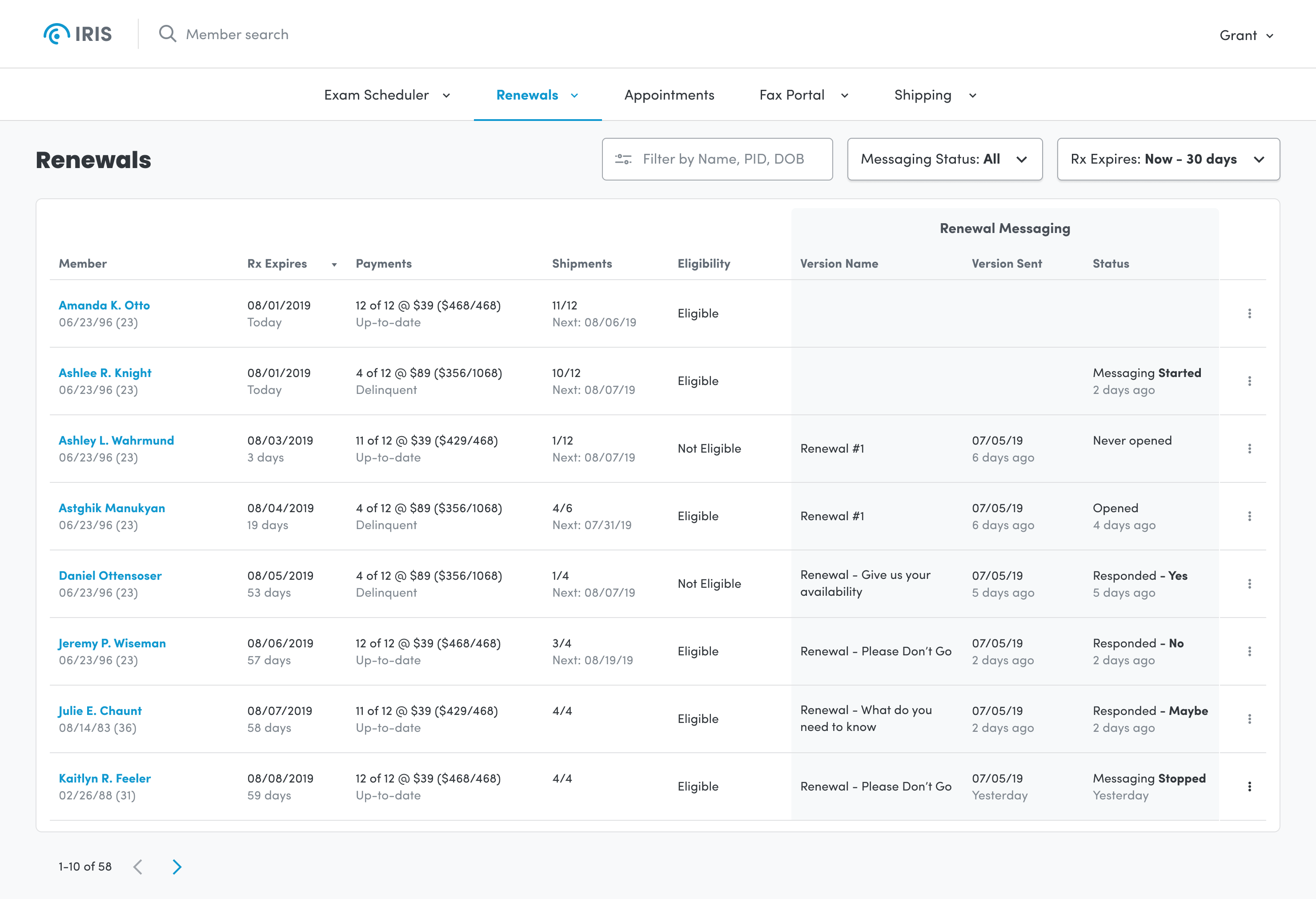
Through lots of rough wireframes and feedback sessions on user flow, I decided on a dashboard style approach. I listed members with their relevant data needed for processing. All the info an agent needed to make a decision was right there, front and center, with buttons tied to the major actions needed to process a member through the flow.
Keeping Automation in mind as the end goal, what can we start now that can help us later? The engineering team and I decided to start an ‘algorithm’ with the data we had, however incomplete or messy it was. We can show what the system is suggesting, but still have the support agent be the one calling the shots. This way we can start to grade the system suggestions vs the reality of what the agents did. This ‘algorithm’ is something we can slowly develop and tweak over time and hopefully it would become super solid as we introduce cleaner data into the system down the road.
Through more in depth conversations with our Member Portal team around automated messaging, we found out we could move away from all the previous ‘steps’ we were using and start to base the members status on where they were at in the messaging flow. Which emails have the users received, which have they responded to, ect. With this new approach to a users status/state we only needed a couple views. I also introduced the notion of letting Support use Filters to help them narrow down on more specific users that may be in more unique situations.
Through more and more feedback sessions and prototyping with Support and Engineering, I found we could continue to simplify the dashboard. We had a simple dashboard that used filters to drive what area of renewals you needed to see. The member messaging turned into a major status indicator. Everyone was really happy with this initial design - it was simple to use yet powerful in all the functionality it provided.
If you’d like to read more about my thoughts on design or my approach and process check out my other case studies.
Portfolio HomeProject: Creating design guidelines and new patterns and components while updating, maintaining, and governing our design system called Hyperspace.
Sprinklr Design SystemCase Study: Redesign the core application to satisfy the growing needs of our customers.
InQuicker Case Study